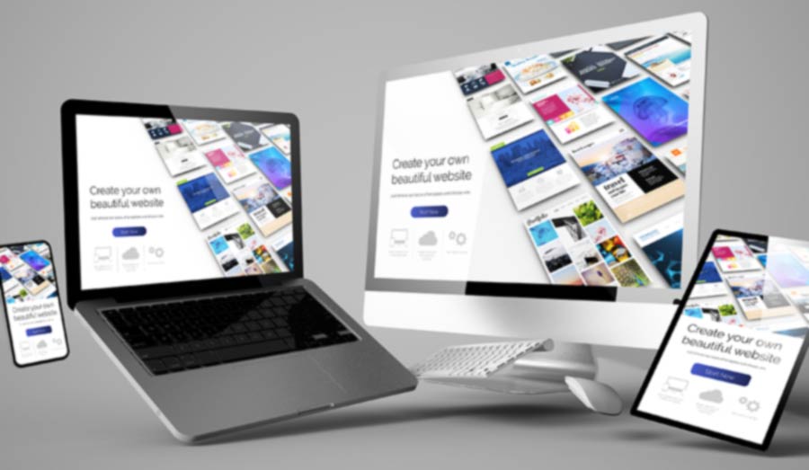
Here at Webnetism we always like to accommodate our clients the best we can. And although we pride ourselves on our website design capabilities, some of our client come to us with designs they’ve already had done.
You may think because they’re familiar with your brand and already do all your marketing material and brochures etc. that getting your own designer to knock up some website design concepts makes perfect sense and, in many ways, it does.
However, bear in mind if your designer doesn’t usually design websites this can add some complications further down the line. Understanding the potential issues laid out below and following the tips should enable your designer to provide artwork files suitable for developers to interpret without too much compromise.
1. Size and Dimensions
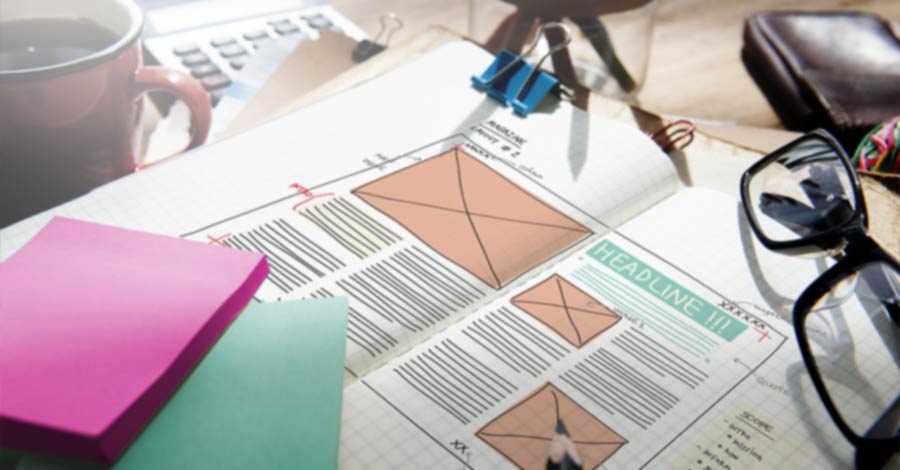
On more than one occasion I’ve been presented with a website design laid out perfectly on an A4 page. Whilst a scrolling website might well represent a portrait A4 sheet there are some things to consider.
Modern websites are designed to be responsive, that means the layout responds to the size of the screen it is being viewed on. So, whether it’s a 4k large format desktop monitor, a laptop or Chromebook, tablet or mobile.
Tips:
Supply designs for more than one format and consider how the page content will adapt to each size. At time of writing I’d recommend providing designs for at least the following pixel dimensions to cover all options:
1920 × 1080 - Large screen desktop
1280 x 720 - Smaller desktop, laptop or landscape tablet
768 x 1024 - Portrait tablet
360 x 780 - Smaller Phone
These are not necessarily the most common sizes or the newest tech, but are the key sizes where the design could be problematic if it doesn’t adapt.
Height is less of an issue since the page can obviously scroll but it’s worth being aware of the visible area before scrolling.
2. Proportions and Scale
Much like getting the size right its important to get the proportions right within the specified size. Where this will be most important will be the font size in relation to the page width. Unlike print where what you design is exactly what everyone will see, for screen unfortunately it is not the same. One 21” monitor may have a different resolution to another 21” monitor. A higher resolution will effetely make the content displayed smaller. This can be tricky to get your head around, even more so with modern screens now having higher pixel density.
But thanks to evolving industry standards, enforced by Bootstrap and the like, it’s fairly common now to see a default font size for the main body content of a website to be about 16px (which isn’t the same as 16pt but it’s near enough).
Tips:
Forget about mm or inches and set the unit preference in your design package to be pixels. Doing that and sticking to the screen dimensions listed above and your text should remain in proportion with your design. Your fonts can then be scaled in relation to the design using 16px as the default.
3. Resolution
I mentioned resolution briefly above, here I’ll try and expand. Dots Per Inch (dpi) is traditionally how resolution is specified. This refers to the number of dots that can be placed along a linear inch. If you look closely at printed material, you’ll see it’s made up of a number of dots. Average printed material is normally 300 dpi, so there’s 300 tiny dots printed along an inch. Newspapers are usually printed at a lower resolution, but high-end print, such a reproduction art prints can be much higher, 600 to 1200 dpi. So basically, the higher the resolution the harder it is to see the dots, so the quality of the image looks sharper.
Newer technology has made understanding screen resolutions slightly more difficult, with greater pixel density giving us Retina Display, 4k and even 5k displays. But as a simple rule a screen is resolution is generally said to be 72dpi, although technically it’s Pixels Per Inch (ppi) and the two aren’t directly interchangeable, but that’s more in depth than I care to get into now.
Tips:
As well as setting your units to pixels, set your working or output resolution to 72dpi. Higher resolution images and artwork simply aren’t needed. Working at a lower resolution will not only help your artwork render quicker when you’re working on it, they’ll also be the smaller files making data transfer quicker when you’re ready to send files to the developer.
4. Fonts or Typefaces
I can’t count the number of times I’ve been supplied a design from a print-based designer that includes fonts that match the corporate brand, but unfortunately are not suitable for use within a website or app.
It used to be you just couldn’t use anything other than a basic system font but that has moved on and most fonts have web versions that can be hosted with the website, but using license restricted print-based fonts, could cost £1000s for web distribution. If you are going to use a premium font, please check carefully the terms of the licence.
Tip:
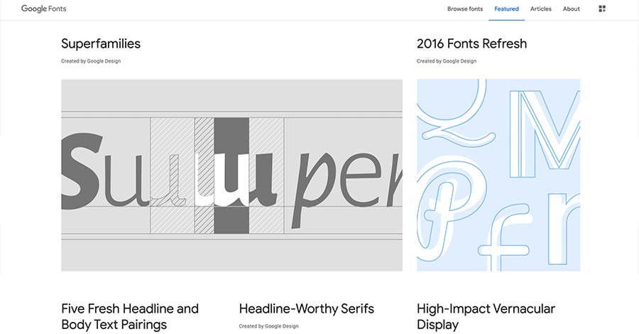
Keep it simple and use free Google fonts, this repository has grown over the years and there is now over 1000 typefaces to choose from. Google fonts can easily be referenced within a website but can also be downloaded and used within the design artwork. Consider updating print-based branding material for consistency.
Oh, and as a side note, letter spacing and kerning are NOT a thing. Don’t use them.
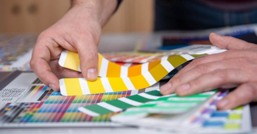
5. Colours
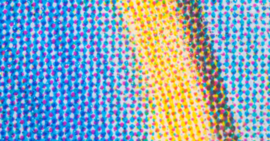
If you usually design for print your software; Photoshop, Illustrator, InDesign or whatever you use will most likely be set up for four process colour printing of Cyan, Magenta, Yellow and Black (CMKY). In addition, it’s not uncommon for corporate branding to use one or more Pantone spot colours.
At some stage in the process, these CMYK or Spot colours these colours will need to be converted to RGB screen colours. Sometimes you’ll see web colours referred to as Hexadecimal, or hex refences, this is just a way of naming RGB.
Tip:
It’s far better if the designer works with screen colours from the start, converting process colours to RGB isn’t always accurate and can create ‘muddy’ shades. Set your image mode preferences to RGB and supply Hex values with your design so there is no confusion.
6. Viewing properties
Similar to the colour issue, there is also a big difference between ink laid on paper (reflective) and screens which are backlit (projected). You also have to take into account the quality and properties of the screen and then the individual settings, brightness, contrast etc. Nearly every screen will give different colour results. Sometimes a light grey will appear more yellow or blue depending on the warmth of the screen settings, or a very light colour may disappear completely.
I have had a client hold a printed business card against a screen and comment the colour of the logo is not right. I took her to a different screen and showed her it was still not right, but in a different way then tried to explain the above.
Tip:
There’s not a lot you can do here other than be aware of this. If you work a lot for print then chances are you’ll have a good quality screen that’s most likely well calibrated. Just be confident that what you design is how you want it, but others might not see it the same. Avoid subtle colour changes as the intricacies may simply get lost.
7. Fine Detail
Again, because screens resolutions are quite course, fine details do not always show as intended. Very thin lines may appear blurry, pixelated or uneven.
Tip:
Use strong bold designs, try block colours to separated sections rather than thin keylines or horizontal rules. Ensure detailed images are large enough so the detail isn’t lost.
8. Consistency
Design elements of a website are often be defined at a global level as a block of code that can be reused through the site. This means each instance of that block will be identical. So if you’re designing a little ‘box out’ to highlight a quote for example, the spacing around this box, the font size within the box, etc will always be the same each time it’s used on the page. I know from experience that for print, even when placing elements on a page form a global library it’s common to tweak the individual instances to achieve that perfect position.
Tip:
When reusing assets around the design don’t be tempted to modify them to make them fit in you design. They should fit without tweaking.
9. Instructions
A static design as a concept for your website is one thing, but a website or app can be so much more. It can have movement and animation, inveracity such as active and hover states, expanding sections or pop-up modals which can be hard to portray on a flat image.
Tip:
Annotate designs and provide instructions on how you expect things to move or interact. Provide designs to show different states like expanded menus or selected buttons.
10. Supporting Information
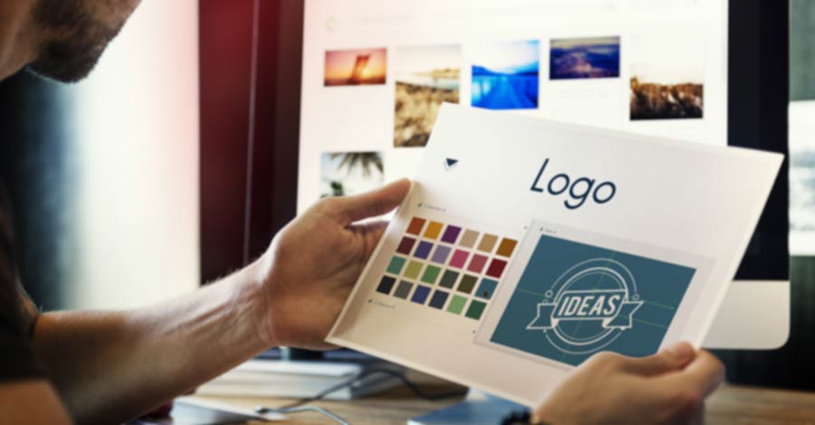
Often a designer will have a wealth of information regarding a brand. Don’t forget to pass on this information. As well as the artwork files mentioned above, supply brand guidelines if they are available. Supply usable version of logos and supporting images.
Tip:
For logos vector graphics can be very useful and if needed can be turned into Scalable Vector Graphics (SVGs) which can help a logo stay sharp. But remember if you’re supplying a logo or artwork file it’s best to turn fonts to paths.
Summary
I hope these 10 points have been useful. We’ll happily work with your supplied designs to achieve your website or web app.
But remember, designing a website isn’t just about making it look nice, the whole user experience needs to be considered. Sometimes a design concept has to change during the development process, and that’s fine and should be embraced.
Ultimately, we are here to help. Even if we haven’t designed the website, we have the experience and can interpret the designs into a fully functioning online experience.
And one last word.
If you are a designer coming from a print-based background, I recommend you experiment with Adobe XD. If you’re already using the Adobe Suite of design packages it will feel familiar. It has many great features that will solve the above issues for you and will help you bundle your project ready to pass on to developers.
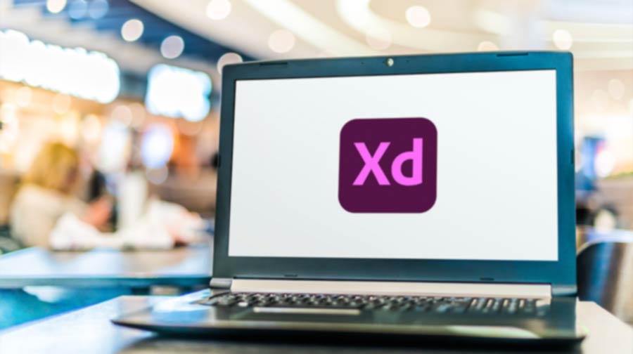 XD image credit: monticello / Shutterstock.com
So if you have a design for a new website that your usually print based designer has put together for you, let us take a look and we’ll be happy to help you turn it into a fully functioning website with all the bells and whistles.
 Get in touch