One issue we face is when clients wish to start adding their own content to a project how do they know the best image sizes to use? What happens when the layout changes or is updated? How about mobile & responsive image sizes?
Using modern CSS properties such as object-fit contain and cover we can utilize modern CSS to help us to make maintaining a project for our clients an easier process.
The issue
To better illustrate the problem let’s consider the following issue.
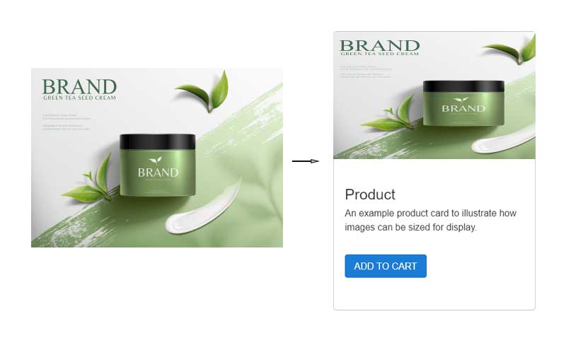
The issue arises when the image is set to 100% width and height to fill the parent container but the aspect ratio doesn’t match, or the size of the image isn’t the same as the parent container. This will result in a distorted image, either stretched or squeezed.
The solution
The object-fit CSS property sets how the content of a replaced element, such as an <img> or <video>, should be resized to fit its container.
Object-fit contain
The replaced content is scaled to maintain its aspect ratio while fitting within the element's content box. The entire object is made to fill the box, while preserving its aspect ratio, so the object will be "letterboxed" if its aspect ratio does not match the aspect ratio of the box.
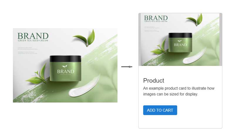
Object-cover
The replaced content is sized to maintain its aspect ratio while filling the element's entire content box. If the object's aspect ratio does not match the aspect ratio of its box, then the object will be clipped to fit.
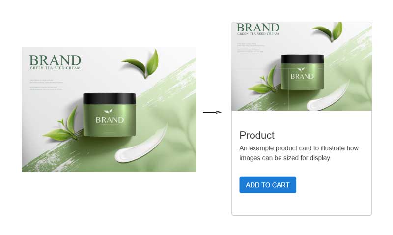
Background images
Another option is to use background images, which then gives use of the background-size CSS properties such as cover & contain as illustrated above.
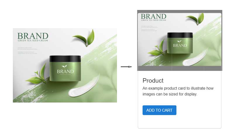
Aspect ratio
Using object fit cover or background size cover there may be a point where an image will be too wide to give a good focal point. To counter this issue we can use the aspect ratio CSS on the image like the following example:
.card__img__wrapper { padding: 1rem; } . card__img__wrapper img { width: 150px; object-fit: contain; aspect-ratio: 2/1; }
So the solution for our clients...
For our clients it is better if we can agree on an aspect ratio for images eg: 4/3, 16/9 and they supply us with hi-res images a minimum pixel width of 1920px @72dpi and we will take care using the best aspect ratio in the layout for the content.
Cite:
 Get in touch