An ongoing battle for every website owner has always been maintaining good search engine results. I mean what’s the point of having a great website if no one can find it?
Well back in the day that all used to be all keywords and content but now there’s so much more and Google rates (and penalises) your website based on so many factors it can get a bit overwhelming.

Now Google has a whole collection of ‘next generation’ metrics - Core Web Vitals. These are user-centric metrics that measure and score, the overall user experience.
In this blog I’m looking one of these user experience-based metrics, something called CLS or Cumulative Layout Shift.
You’ve probably experienced this yourself and been annoyed by it without really thinking about what’s happening or why, it’s just annoying. Which means it’s a good thing that Google are looking to rule out this phenomenon. But if your website is affected, what can you do?
What actually is it?
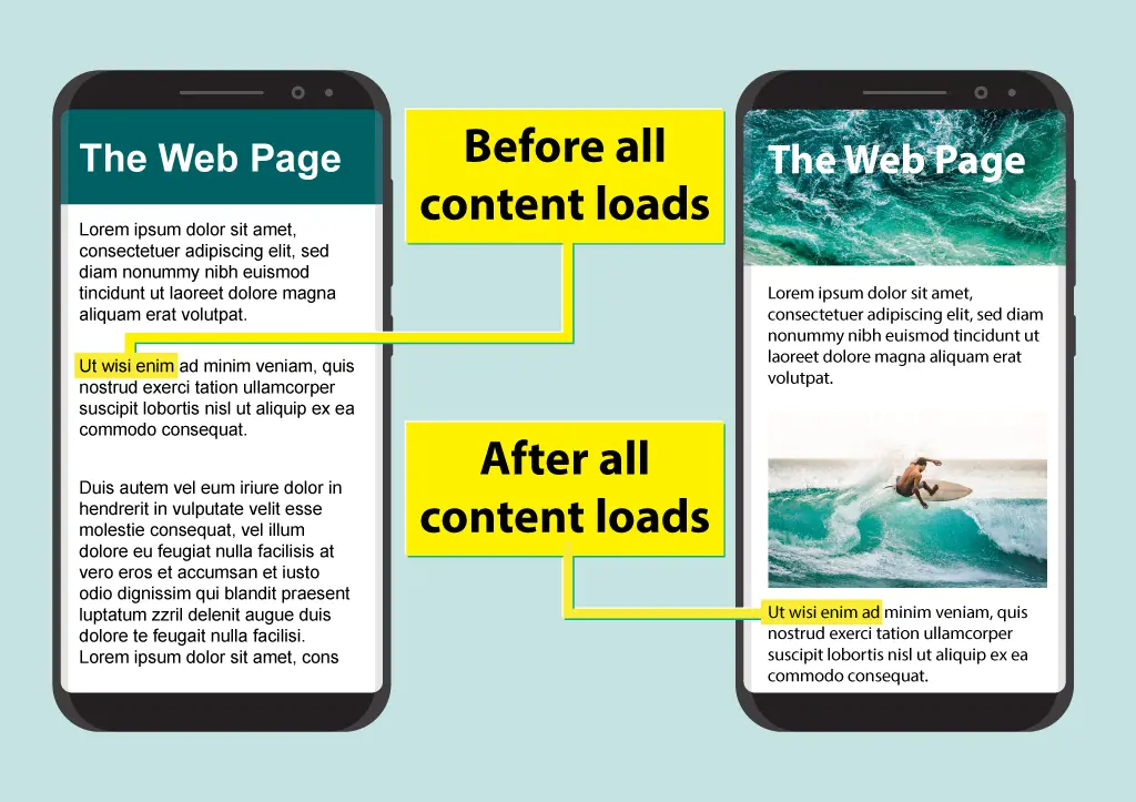
Let’s start by explaining what the issue is. Cumulative Layout Shift sounds quite technical, but cumulative means ‘something that increases as more things are added’ so as more things are added or loaded into the web page you are viewing, the layout shifts or jumps around to accommodate them.
When a web page loads into the browser the first thing to load is the HTML that contains among other things, the text! A a user visiting a website will generally start to read as soon as there’s something there…. But over the next few seconds the rest of the page loads and strange things begin to happen. Banners load at the top of the page, pushing the text lower down the page, more images load, videos appear, a dynamic map is brought into the page and so on and as the result the layout shifts even more.
Maybe you’re a fast reader, perhaps you’d already made it to the second line on the third paragraph. But now you have no idea where the third paragraph has gone as it’s off the screen (or viewport).
How did this happen?
It never used to be a thing, when I started making websites web pages were constrained to set sizes. We used to design to 800 x 600 pixels as that was optimal for a 15” monitor that a home user might have. Everything was laid out on the screen pixel perfect, just as it was when we designed for the printed page.
As tech progressed and things got cheaper the most common monitor size grew to 17” then 21”, 23” and so on, then widescreen formats started to take over, laptops started to come in many more sizes and then before we knew it, we were all browsing websites on mobile phones – and there’s certainly no ‘standard’ size mobile phone screen these days. I won’t even get into retina displays, 4k, 5k 8k! etc
The solution to this problem was responsive website design! I remember writing a blog about that it seems not so long ago (https://www.webnetism.com/blog/responsive-website-design-mobile-specific-website).
Anyway, this meant one web page for all screen sizes whatever the device. We no longer set sizes, after all if you have an image that’s 500 pixels wide by 300 pixels high it’s not going to fit on an iPhone 4 with a screen that’s only 320 pixels wide - and horizontal scrolling just doesn’t feel right. Instead, we just set up rules and let the sizes be flexible depending on the screen size. Images were just set to 100% width via a style sheet, so they’d shrink to fit on a mobile screen and scale up to display on a desktop. Heights were cleverly set to be ‘auto’ so the image wouldn’t stretch or be distorted.
For a while life was peachy.
Internet speeds got faster, content got richer, external content such as adverts, videos etc. got added, design trends evolved and so on. Till where we are now with an average web page needing to load so much more content than it ever did. We put up with jerky page loads accepting it as part of the process, till Google got involved and said ‘no more’.
So how do we fix it?
The answer is to get a bit old school! Well kind of, but with the help of some modern thinking. We need to get back to basics and make sure our content, whether it’s an image, an iframe displaying a video, advert, or interactive map etc, is all declared with an actual pixel width and height attributes.
As I said previously the core HTML containing the text loads first, but within this HTML there will be an instruction for ‘image goes here’ but with the dimensions of that image now added the instruction will be more like ‘image goes here – please allow a space of 500px by 300px’ so the text will load with a big blank placeholder.
It then doesn’t really matter when the image loads because there’s some space saved for it, and when the image does finally load it will just fill the gap rather than before when the browser had no idea how much space was needed or where things would be until everything was loaded.
This perfect page without the layout shift provides a much more satisfactory user experience, and as a result bags you a better Google ‘score’.
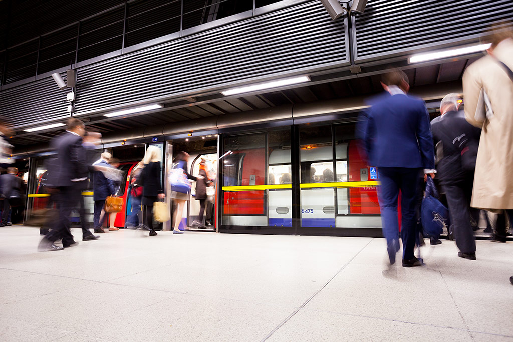
Picture it like the difference between a busy tube train, where everyone gets jostled around and moves about making space as the carriage fills up compared with a first-class carriage where all the passengers have already reserved their seat so even before they’ve arrived at the station their space is allocated.
But what about responsive?
Ah, so you’ve noticed. First, we set sizes, then we took them away and now we’re being told to put them back.
How will that effect our example of or 500 pixel wide image on a 320 pixel wide mobile phone?
Well, here’s where the modern thinking kicks in, latest browsers are on the ball, and now do some calculations that will look at the width and height of an item where specified and work out the aspect ratio. The aspect ratio part will take over and the image will still scale as required for the screen size.
To help it along as web site designers and developers there’s still a few extra tricks we can do behind the scenes. We’ll talk about that more in detail next time.
Don’t hesitate to get in touch if you’d like to talk to us about improving your Google Core Web Vitals Score and in turn providing a better user experience.
 Get in touch