
If you've spent any time building websites or apps, you've almost certainly encountered menu icons with surprisingly food-related names.
The hamburger menu, kebab menu, meatballs menu, bento menu... they all represent different ways of presenting actions, navigation, or content. Yet many developers and designers use the terms interchangeably, while others aren't even aware that the icons have official names.
So why are there so many menu icons? Does it matter which one you choose?
Let's break them down.
Why are there so many menu icons?
The short answer is that they solve different problems.
As user interfaces evolved from desktop applications to mobile-first experiences, designers needed compact ways to expose navigation and actions without overwhelming the screen. Rather than inventing entirely new patterns for every application, common visual metaphors emerged.
Some of these icons became popular through specific design systems:
- The hamburger menu became widespread alongside the rise of mobile apps.
- The kebab and meatballs menus were heavily popularised by Microsoft's Fluent Design.
- Google's Material Design generally refers to the three-dot menu as the More or Overflow menu.
- Apple's Human Interface Guidelines also use variations of overflow menus without necessarily assigning them food-inspired names.
The names themselves aren't official standards—they're simply memorable nicknames adopted by the developer community.
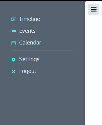
The Hamburger Menu (☰)
Three horizontal lines.
Probably the most recognisable menu icon on the web.
What it's for
The hamburger menu is typically used for primary navigation.
Clicking it usually reveals:
- Site navigation
- Application sections
- User areas
- Major features
It's especially common on mobile devices where screen space is limited.
Why use it?
Use a hamburger menu when:
- You need to hide navigation to save space.
- The menu contains multiple destinations.
- The navigation is global rather than contextual.
Things to consider
Although familiar, hamburger menus can reduce discoverability because the navigation is hidden by default. Modern design often favours keeping important navigation visible whenever possible, especially on larger screens.
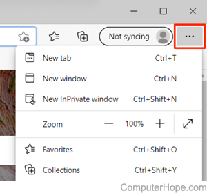
The Meatballs Menu (•••)
Three horizontal dots.
What it's for
Functionally, the meatballs menu is almost identical to the kebab menu.
The difference is simply orientation.
Some operating systems and design languages favour horizontal dots over vertical dots.
Why use it?
Usually because it matches the design language you're following.
Users generally interpret both icons as "more options."
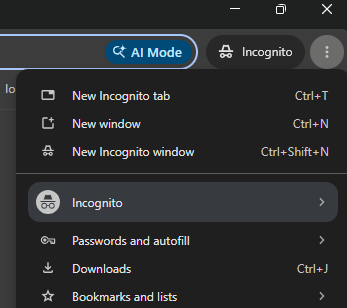
The Kebab Menu (⋮)
Three vertical dots.
What it's for
The kebab menu usually contains secondary actions related to the current page or item.
For example:
- Edit
- Delete
- Share
- Rename
- Duplicate
Rather than taking you somewhere else, these options perform actions.
Why use it?
Choose a kebab menu when:
- The actions aren't important enough to always display.
- You have several related commands.
- The menu belongs to a specific object or screen.
It's commonly found in lists, cards, tables, emails, and messaging apps.
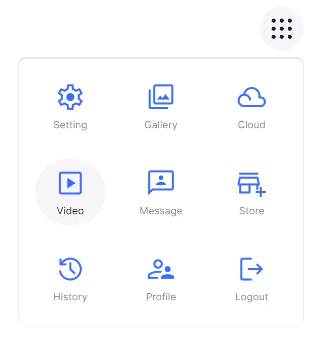
The Bento Menu (⠿)
A grid of squares.
What it's for
The bento menu is commonly used to display a collection of applications or services.
A good example is Google's app launcher, which lets users switch between products like Gmail, Drive, Calendar, and Docs.
Why use it?
Use a bento menu when you're presenting:
- Multiple applications
- Dashboards
- Product suites
- Collections of tools
It's less suitable for navigation within a single application.
The Ellipsis
Technically, both the kebab and meatballs menus are forms of the ellipsis menu.
Many design systems simply describe them as an overflow menu or more actions menu rather than giving them food-inspired names.
This terminology is often more appropriate in documentation, since it focuses on what the control does rather than what it looks like.
Why choose one over another?
The choice should be driven by meaning, not personal preference.
A useful rule of thumb is:
| Icon | Best used for |
| Hamburger | Main application or site navigation |
| Kebab | Additional actions for the current item |
| Meatballs | Same as kebab, depending on design language |
| Bento | Switching between apps or services |
| Ellipsis | Generic "more actions" or overflow menu |
If users expect an icon to perform one function but it performs another, confusion follows.
For example, hiding your site's primary navigation behind a kebab menu would feel unusual because users typically associate that icon with actions rather than destinations.
Does accessibility matter?
Absolutely.
Icons alone aren't accessible enough.
Screen readers don't understand that three horizontal lines mean "navigation" or that three dots mean "more options."
Always provide:
- An accessible label (aria-label="Main menu" or aria-label="More actions").
- A proper button element.
- Keyboard accessibility.
- Visible focus indicators.
- A sufficiently large touch target.
The icon is simply a visual cue—the accessible name tells assistive technologies what the control does.
Are there standards?
Not officially.
Neither HTML nor accessibility specifications define what these icons should mean.
Instead, consistency has emerged through years of common use and adoption by major design systems.
Therefore following established conventions is usually the safest option. Users build expectations over time, and meeting those expectations reduces cognitive effort.
Is it important?
Yes—but perhaps not for the reason you think.
Most users won't know what a "kebab menu" is called.
They will notice when an interface behaves differently from what they expect.
Choosing the right menu icon isn't about following arbitrary naming conventions—it's about communicating intent.
Use familiar patterns, keep important actions visible where possible, ensure menus are accessible, and stay consistent throughout your application.
At the end of the day, users shouldn't have to think about your menu icon at all. If they instinctively know what it does, you've chosen the right one.
 Get in touch