2011
To get some perspective:
- Google Chrome was still in its infancy after only being released a few years earlier.
- Firefox was at version 4 and was the popular choice for those that didn’t want to use Internet Explorer.
- Windows was at version 7 and Internet Explorer was still the choice for many and IE10 had just been launched in April, meaning older versions were still very much in use, including IE7 and, IE 6 was still haunting us.
- For Mac users the Operating System was still working its way through the Big Cats, Mac OS X 10.6 Snow Leopard was current, the first release that was Intel only, rendering older PowerPC Macs now obsolete.
When I first started at Webnetism in 2011, the design process was quite straight forward and not much had changed really over the last decade. On receiving a brief, a homepage mock-up design would be started, this would either be in Adobe Photoshop, or my preference was Adobe Fireworks. A homepage design was treated in much the same way designing a magazine cover was done.
This would be a static image usually 1000 pixels wide, targeting the most common monitor screen size with a width of 1024 pixel.
By designing to 1000 pixels wide this allowed scroll bars to appear at the side on longer pages, without then adding a horizontal scroll bar at the bottom. For larger screens a background image, or colour was added as a filler.
Once the scene was set with the homepage design a few key inner pages would also be mocked up. If the site was an ecommerce platform this might be a product page and the category listing, but for an information-based website this might just be a content page. The series of static images were presented to the client.
But things were about to start getting interesting.
The original iPhone had been around for a little over 3 years, and with-it competition was strong from the various manufacturers putting out their Android offerings. Smart phones were set to take off.
The tiny (by today’s standards) 3.5” Apple iPhone 4 was the current model, 4s wasn’t released till October 2011. Apple didn’t join the 4G roll-out till the iPhone 5 at the end of 2012.
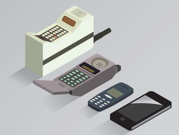
If you were well off and a bit of a tech geek you might have a 1st Generation iPad, released the previous year, or the brand new iPad2 released internationally March 25th 2011.
Websites on mobile were not yet of big concern, but we were starting to change our thinking towards them, the mobile view was definitely something to consider.
Other news for 2011
- World population reaches 7 billion.
- Space Shuttle program is officially ended.
- Iraq War ends.
2012
Our first fully mobile specific website was built for Mira Showers, it was their online parts store.
We shouted about it back in February 2012.
Imagine you’re a plumbing engineer on site, called out to fix a shower. The idea of being able to look up and order spare parts on your phone at the customers address was a game changer for the industry, now it’s just a way of life and what we expect.
We already provided the desktop website. Both the desktop and mobile front-ends shared the same CMS and database but they had their own design and HTML build, device detection delivered the appropriate skin.
2012 also saw us start work on our first native iOS app (launched in 2013). A sales tool for UKWGD (then MASCO), which among other things allowed sales reps out on the road to make notes, access clients and book appointments as they travelled.
It wasn’t just the mobile revolution that was in full swing, SEO was a big deal, but it wasn’t just about keywords and search engine results anymore. Google Analytics first introduced heatmaps in 2010 but 2012 saw a much improved in-page analytics. Combined with device data we were really starting to understand how the user interacted with our websites.
Real life, measurable user research, beyond controlled focus groups was now taking shape. As designers we could get user feedback to confirm how users interacted with the site.
Other news for 2012
- Vladimir Putin is elected president of Russia for the third time.
- Barack Obama wins second term as President of the United States.
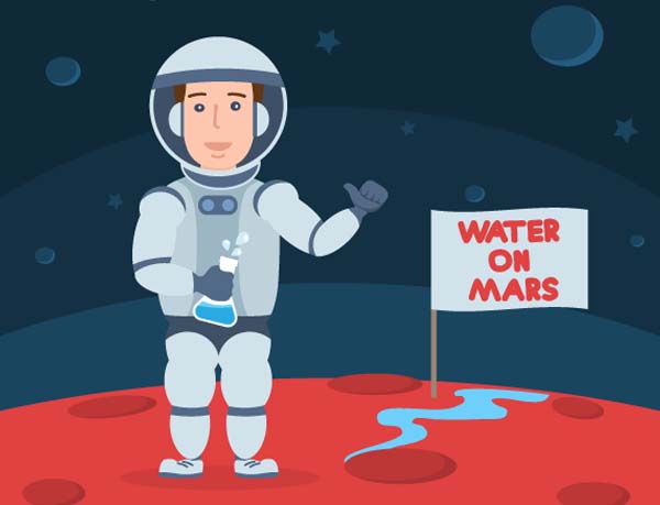
- The US rover, Curiosity, takes a selfie on Mars and finds evidence of an ancient streambed of water on the Red Planet.
- Diamond Jubilee of Queen Elizabeth II.
2013 – 2015
Reacting to the user research, May 2013 saw us launch an update to the Hazelwoods website, where the driving force was user centred design thinking, where the redesign was focused on how the users were using the website.
In tech, 4k was the buzzword for screens, voice recognition had gone the next level (Siri was in the iPhone 5, but it wasn’t till the 5s that it got good enough to really use). Wearable tech and VR were taking off in a big way. Talking of taking off – Drones were the next big thing too.
4K and Apples Retina Display screens were crisper with much higher definition. It wasn’t uncommon for a typical desktop screen to be 23-27” and also now in 16:9 format. Along with Siri, the iPhone 5 saw a larger screen.
For phone users devices are generally held portrait as opposed to the landscape format we’re used to designing for and how users were interacting were changing with swipe and pinch and zoom.
These extreme differences in size, scale and format turned website design on its head. For many years the design process hadn’t been much different to print based design, other than designing for pixel dimensions of the most common screen size rather than A4. But designs now had to be fluid, they had to adapt gracefully to whatever screen size the viewer was using.
Back in June 2013 I published a blog explaining more about responsive mobile first design.
February 2014 saw a follow up on the previous blog, with this analysis on responsive design vs a mobile specific site in https://www.webnetism.com/blog/responsive-website-design-mobile-specific-website
This new approach needed and updated framework, HTML 4 had been around since 1997, the most recent version 4.01 had its release in May 2001. CSS2 much the same. Because of this January 2014 saw us asking if we should start using HTML 5 and CSS3. HTML 5 had been hanging about in Beta since 2008, but it wasn’t until October 2014 that HTML 5 was the official recommendation.
Throughout 2014 and well into 2015 we published blog after blog as our clients all updated their websites to new responsive layouts.
As the approach to building websites was changing the approach to designing was also under review. Providing a static image or two to the client to represent how their website would look based on a fixed size screen wasn’t enough anymore. Adobe Photoshop celebrated its 25th anniversary in 2015, I marked the event here. But Photoshop had never really the right tool for website design and Adobe had shelved Fireworks in 2013.
Other news 2013-2015
- Death and state funeral of Nelson Mandela.
- Second Libyan Civil War begins.
- Liquid water is found on Mars.
- The Supreme Court of the United States determines that same-sex couples have a constitutional right to marry.
2016
To save the day, Adobe released the on beta "Adobe Experience Design CC" to anyone with an Adobe account, on March 14, 2016. Now commonly known as Adobe XD.
XD allowed (and still allows) us to do more than create designs, we can mock-up prototypes with movement and interactions that represent the functionality of the finished website.
No longer were we just laying out static screens, but instead we were taking a brand design to the next level, designing elements, and building them into design systems that would allow us to create a reusable UI-Kit of components that would become the building blocks of the design. Prototyping entire user journeys quickly allowed us to present clients with more designs, more motion and interaction that better represents the end result.
Other news 2016
- The people of the United Kingdom vote to leave the European Union; David Cameron resigns as a result, and Theresa May succeeds him as the Prime Minister.
- NASA space probe, Juno enters orbit into Jupiter.
- Augmented-reality game, Pokémon Go, is released, breaking records in revenue, and becoming the best-selling mobile game.
And 2017
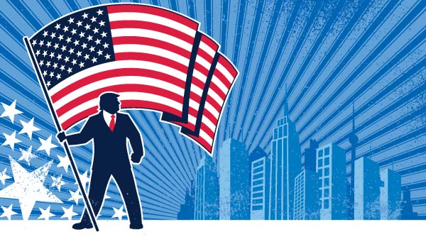
- Donald Trump is inaugurated as President of the United States.
- A terrorist bombing attack at an Ariana Grande concert in Manchester, England kills 22 people and injures over 140.
2018
In the way the introduction of Adobe XD had helped us enter a new era for design, adopting Agile Scrum methodology in 2018 helped us move towards the next stage of our entire workflow.
The divide between design and development was closing, the team was coming together and communicating better. It was less of a hand over from the design to development team, less of a them and us attitude, instead we saw more of an ongoing process with everyone involved. As designers, using prototype tools we were able to focus on further on the user experience (UX) throughout the whole user journey and not just the user interface (UI). Developers were able to walk through the prototypes to clearly understand the requirements of the product.
Other news 2018
- Wedding of Prince Harry and Meghan Markle.
- The first summit between the US and North Korea and the first ever crossing of the Korean Demilitarized Zone by a North Korean leader occur.
And 2019
- A major fire engulfs Notre-Dame Cathedral in Paris, resulting in the roof and main spire collapsing.
- US President Donald Trump is impeached by the House of Representatives for abuse of power and obstruction of Congress.
- The Event Horizon Telescope takes the first ever image of a black hole, at the core of galaxy Messier 87.
- The United States Space Force is announced by Vice President Mike Pence and created in December.
2020-2021
Focusing more on UX and UI was now well and truly an ingrained part of our process and client were getting used to seeing our interactive XD prototype links. But for many the terms UX and UI were still fairly new so I published this blog in February 2020: How are UX andUI design related and yet very different.
Other news 2020-2021
- January 1st, 2020. The COVID-19 pandemic begins in Wuhan; the start of an ongoing global pandemic.
- The COVID-19 pandemic spreads from China to the vast majority of the world's inhabited areas, infecting at least 81 million and killing at least 1.8 million people in its first year.
- Donald Trump is acquitted by the United States Senate in his first impeachment trial.
- Crewed spaceflight resumes in the United States for the first time since 2011.
- Fears of COVID-19 cause the Dow Jones Industrial Average to fall ten percent in one week, its largest drop in history, triggering the COVID-19 Recession, the worst economic crisis since the Great Depression.
And that brings us up to possibly the most significant period in modern history – the Coronavirus Pandemic. Spring 2020 brought massive change for everyone. Working from home, Zoom calls for many but for us it was Teams Meetings and various cloud based tools, but what also came from this was a sense of focus.
For many of our clients this meant their website was now more important than ever. After the initial flurry of adding Covid statements and updated open hours or instructions on how to get in touch we started working with our clients to streamline their existing website. To react to user research, to improve user journeys. To dig deeper into Googles core web vitals and present better performing solutions.
The future
I don’t think any of us can predict the future (the last two years has taught us that) but looking back over the past 10 years I’m sure designing software, apps and website will continue to be evolve. User centred design thinking is the way forward, streamlining the user journey based on the users needs and expectations. Using latest technologies to build faster better websites. And designing attractive, interfaces.
The modular approach to UI-kits, with design systems and component libraries may feel like designers aren’t “designing” anymore, we’re just putting together user interfaces based on building blocks, but that’s not the case. It’s just we need to think differently and think bigger. We’re no longer designing ‘magazine’ covers, we’re not just designing visuals, we’re designing processes and themes. We’re designing products and experiences.
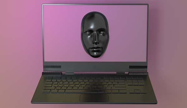
I also think artificial intelligence and voice control will continue to grow for more and more things….. watch this space.
Credit to, and for more interesting facts check out https://en.wikipedia.org/wiki/Timeline_of_the_21st_century
 Get in touch